Colour Matters: What your brand colours say about your business
Colours and their meanings will vary depending on region, culture and relevant context. Colour theory has many aspects to it but you can easily learn the language of colour by understanding a few simple concepts.
Key points to keep in mind when designing in colour:
- Colour is the first thing a consumer will notice
- It is important to integrate your brand colours across the board in all your collateral marketing pieces from your logo to your landing pages (web site), products and packaging to achieve the highest memorable impact possible
- Studies show a product’s colour influences 80% of a customer’s purchasing decisions (colour can make or break a product)
- Consumers are sophisticated and already know whether or not your logo and branding colours really connect to the product you are selling
Colour = Non-verbal communication
For centuries the strategic use of colour has been a factor in persuasion.
The psychology of colour as it relates to persuasion can be one of the more controversial aspects of modern-day marketing. Most of us don't even realize how much it really affects us. Those in the advertising and marketing industry have spent a gargantuan amount of money in persuading us into buying and using their products and services. Although there will always be skeptics out there, and this isn't an exact science, however countless studies have proven colour does have a profound affect on moods and human behaviour.
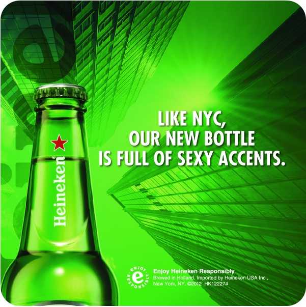
It is fascinating to think that by simply changing a colour one can also change the meaning of something. If the Heineken® logo were suddenly now red and CocaCola™ logo green, it would completely alter how we think of these products. A company must know its target audience well and give some thoughts to the psychology of the recipient. The main point is that when designing a marketing campaign, a brand or identity, think about what kind of emotion you want your customers to feel, not only on first glance but when they use and interact with your product or service. Colours can be a powerful tool to entice and engage your target market, so if properly used it can be extremely beneficial to your overall marketing success.
This article leans to generalization, so readers who aren't trained designers shouldn't expect to walk away thinking that they will know everything about colour theory. In reality there are just far too many other factors in the various complexity of hues not to mention other associated non-verbal cues which can also affect how a brand is perceived. At Canada Coaster we design coasters. We're the largest manufacturer in North America of the highest quality pulpboard coasters available. Think about this, whatever can be printed, can be printed on a coaster. It's a mini-billboard with a multitude of practical uses. The wide array of customers from the smallest to some of the biggest brands on the planet use our products and services for their marketing campaigns. We hope this information will be useful regardless what type of business you operate. So let's get to the basics...

Learning about effective colour branding techniques can elevate your product or business into something unique, instead of just being another commodity among the crowd.
The visual aspects of your advertising and marketing campaigns are essential to getting positive results. Standing out from your competitors is particularly important in a competitive marketplace. The understanding of basic colour theory can help you create attention-grabbing marketing materials that stimulate interest in what you have to say.
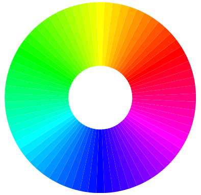
Designers understand the principles of the colour wheel, and it really isn't rocket science. Essentially there are three levels – primary, secondary and tertiary consisting of three primary colours red, yellow and blue. The next level on the colour wheel keeps these three and adds the the results of mixing the possible combinations to create orange, greeen and purple. The third level on the colour wheel includes additional mixing of primary and secondary such as yellow-orange and blue-green.
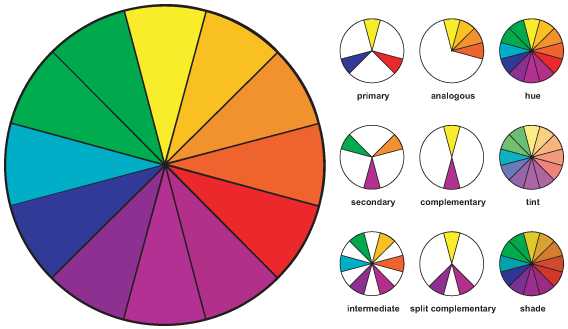
Designers use the colour wheel as pictured above to choose their colour scheme in the following ways:
COMPLEMENTARY – use of two colours from opposite ends of the colour wheel can be pleasing to the eye and most common in print media. Used together, this combination of warm and cool colours can create excitement and energy.
SPLIT COMPLEMENTARY colour schemes combine the two colours on either side of a colour’s complement. This combination of colour adds variety to a brand in a pleasant but active way.
TRIADIC – Use three colour equally spaced on the colour wheel. This tends to give a harmonious effect and used for bolder effects.
SELECT COLOURS THAT EVOKE EMOTION TO STRENGTHEN YOUR BUSINESS BRANDING
Choose colours that represent and speak to the marketing message you want to communicate, and then build the scheme around them.
 Red – a power colour; increases passion and intensity
- Encourages appetite; often used by fast-food chains
- Creates a sense of urgency -- action, power, energy, speed
- Associated with excitement and passion; used frequently in sales
- High energy and immediately pulls focus
- Stimulating. Affects nerve impulses, raises blood pressure and heart rate
 Yellow – promotes curiosity; stimulates the mental process
- Represents optimism, youthfulness often associated with warmth and cheerfulness
- Encourages communication
- Used to draw in impulsive buyers and window shoppers
- Stimulates logic centre of the brain and promotes enthusiasm
- If used too frequently, can create a sense of anxiety, fatigue and strain
 Blue – associated with peace, serenity, water and sky
- Provides a sense of security, reliability and promotes trust in a brand
- Curbs appetite and stimulates productivity
- Most common colour used for offices and conservative corporate brands
- Calms the mind, providing a sense of tranquility and space
- Young people associate blue with maturity.
 Orange – creates a call to action, excitement and enthusiasm
- Represents a friendly, cheerful and confident brand
- Used in sales to stimulate action; buy, sell, subscribe
- Enthusiasm, fascination, happiness, creativity
- Orange can also signify caution and agression
 Green – associated with health, tranquility and nature
- Also associated with money, growth and wealthy people or brands
- Used in stores to relax customers
- Frequently used for promoting environmental issues
- Has been used as a symbol of fertility
- Green stimulates harmony in the brain encouraging balance between body and emotions
 Purple – associated with royalty, wisdom and respect
- Stimulates the problem solving area of the brain as well as creativity
- Frequently used for beauty and anti-aging products
- Represents a creative, wise and imaginative brand, service or product
- Purple is associated with wisdom, dignity, independence, creativity, mystery, and magic
- Almost 75 percent children prefer purple to all the other colours
 Black – often associated with authority, power, intelligence, stability and strength
- Black contrasts well with bright colours
- Combined with red or orange - very powerful colours - black lends to a very aggressive colour scheme
- Frequently used to trim down appearance of sizes and items
- Can often overwhelm people if it is used too frequently
 White – in advertising white is usually associated with feelings of purity, cleanliness and safety
- White can be used to project the absence of colour or neutrality
- White is associated with hospitals, doctors, and sterility
- White is often associated with low weight, low-fat food, and dairy products
- Using white can spark a sense of creativity since it acts as a clan slate
Choosing Contrast – Contrast reduces eye strain and focuses attention onto a specific item
Shades and Hues – Colour schemes can be used in multiple ways to achieve different effects
Monocromatic – tend to be easy on the eye. Good for websites.
Grey – symbolizes feeling of practicality, timelessness and solidarity in life
- Too much grey often leads to feelings of nothingness
- Though grey is nice to have, it can draw in emotions of old age, death and depression
"It is important not to confuse colour psychology with colour symbolism. For example, symbolically, red may be used to denote danger, largely due to the fact that reds have the illusion of appearing nearer than other colours and, therefore have greater impact. In colour psychology, on the other hand the colours of danger are yellow and black. In colour symbolism, green denotes envy in many cultures, while in colour psychology, it is associated with balance." Originally posted by wiki article.
Creating a colour scheme is essential to good design.
A couple of useful colour tools available online:
Mudcube Colour Sphere
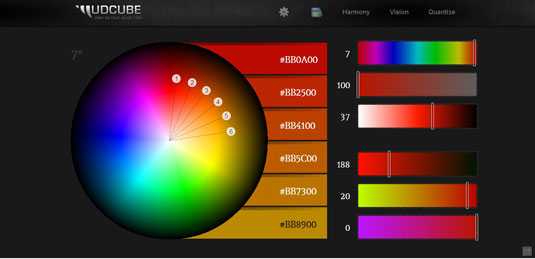
Mudcube Colour Sphere: This colour resource for designers not only provides the hex numbers for each colour; it also helps you to build up a colour scheme from one chosen shade. If you're unsure what colour scheme you should be going for, Mudcube provides a selection of themes from a drop-down menu.
Kuler
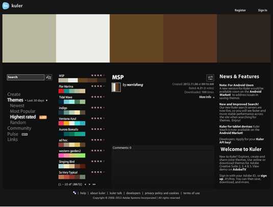
Kuler: Perhaps known as one of the best online colour theme tools, Adobe Kuler has graduated from a simple web-based colour tool to a fully fledged theme generation and sharing resource. Plugins are available for all the main Adobe tools including Photoshop, Illustrator and InDesign, making it a great integrated tool for regular Creative Suite for designers.
Sources & Resource Links we recommend:
- Color Symbolism: What Different Colors Mean to Us by Jacci Howard Bear
- The Psychology of Color in Logo Design (INFOGRAPHIC) by Brian Honigman, Digital Marketing Exec
- Best Practices: How to Use Color in Global Marketing
For those into a more therapeutic and holistic approach to colour will surely find this blog article with its ancient historical references quite fascinating: http://health.iafrica.com/holistic/897008.htm
Creative without strategy is called 'art.'
Creative with strategy is called 'advertising'
In the world of branded beverage coasters, you're not just restricted to a bland, printed rectangle or round shape. The options are bountiful, for example, custom die-cutting lets you completely alter the shape of your media so you can create almost any uniquely shaped coasters to suit your presentation. Changing the shape of your media makes it easier to remember and harder to part with since it looks and feels different from the standard template.
Check out our stock custom coaster shape pricing options!! Do you have other customization ideas not listed here that you'd like to try? Contact us and we'll get right back to you!
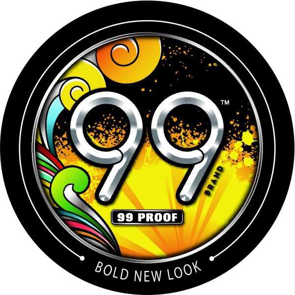
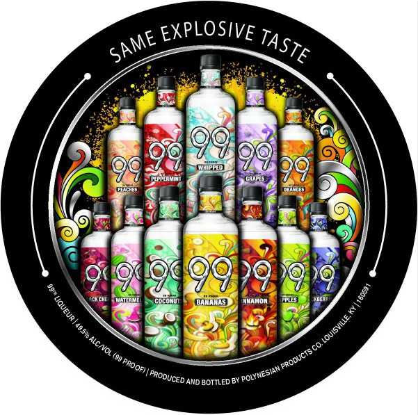
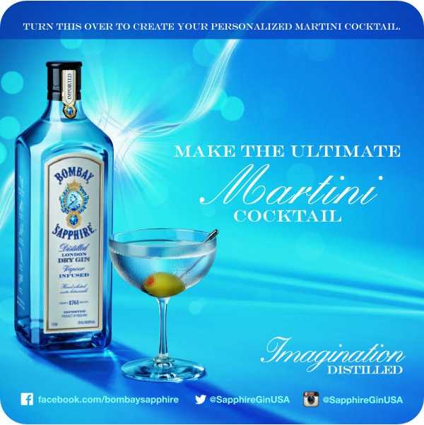
COLOURS STAND OUT BRILLIANTLY ON THESE COASTER ADS
For more examples of coaster designs, check out the Canada Coaster Gallery section <--
blog posts by Alex Zafer
